When it comes to iconic sports logos and uniforms, you think of the New York Yankees, Montreal Canadiens, Green Bay Packers, and the Boston Celtics. Of course what helps make these logos and uniforms iconic is winning. Teams that radically change their logos and uniforms do that to attract interest and change a losing culture such as when the Los Angeles Kings went silver and black and when the Tampa Bay Buccaneers ditched the orange creamsicle look and Bucco Bruce.
The New York Islanders won four straight Stanley Cups from 1980-1983 and they were one of the last dynasties in NHL history. Bossy, Troottier, Potvin, Gillies, Smith, and Nystrom are just some of the big names that carried the Islanders to immortality. The Islanders won with a basic look. Like the Mets, they had royal blue and orange as their colors. The logo featured an NY over a silhouette of part of Long Island: Nassau and Suffolk counties. Part of the Y is made to resemble a hockey stick, with three orange stripes near the bottom of the shaft and a puck located to the right of the stick blade. It was a simple and classic logo and it became somewhat iconic because of winning. It doesn’t have the longevity of the Rangers’ look, but it had more winning.
After the Cup victories, the teams started to fall apart. Fan support started to suffer but the real culprit was losing and the losing was a result of an absentee owner named John Pickett who people claimed only still owned the team while he lived in Florida because of a sweet cable deal with SportsChannel.
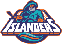
While Pickett still owned the team, he delegated leadership to a management team that hoped to buy the team. So to spur interest in the team, they thought they needed to update the logo and connect it to Long Island. Before the 1995–96 season, the Islanders unveiled a logo depicting a fisherman holding a hockey stick. The logo was a marketing disaster; the reaction among the fan base was so negative that management announced it would revert to the original logo as soon as league rules allowed them to do so. Many fans found that the logo bore a strong resemblance to the Gorton’s fisherman; indeed, New York Rangers fans taunted the Islanders with chants of “we want fishsticks” long after the logo was discarded. The jerseys had uneven stripes resembling an ocean wave near the waistline, on the sleeves, and across the shoulders. All of the numbering and lettering on the jerseys also followed the wave pattern. They also added new colors including navy blue and a brighter orange, and introducing teal and gray shades. It was awful and such a disaster that the Islanders decide to ditch the fisherman logo, but league rules forbade them from switching jersey designs for the 1996–97 season on only a few months’ notice. So they were stuck with the Gorton’s Fisherman for another year and still didn’t ditch the wave look until 1998-99.
The poor marketing was one step in a consistent set of back steps made by the Islanders franchise including the attempt by con-man John Spano to buy the team and moving to an arena in Brooklyn not built for hockey. I still contend they’ve never recovered from the Gorton’s fisherman even if you’re supposed to trust the Gorton’s fisherman.